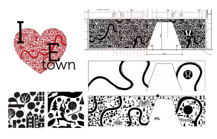
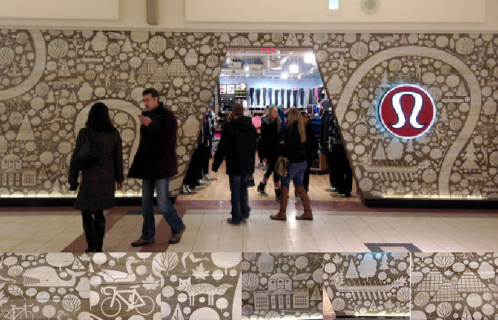
One Lululemon Edmonton store demonstrates the athletic apparel company’s interest in honoring the local spirit. With the help of a Albertan illustrator, Jason Blower, the franchise was given a Canada-themed makeover featuring great symbolism to describe its setting and its people.
The artist elaborated upon some of his earlier designs that represent the provincial capital city, transforming them into a collection of glyphs that would end up being sandblasted onto wooden panelling. The black and grey planks picture people in motion, yoga poses, bicycles, war canoes, plenty of trees and leaves, and a meandering band to portray the path of the North Saskatchewan River.
The shopfront design of this Lululemon Edmonton greets shoppers with a warm and patriotic tableau, demonstrating the retailer’s sensitivity to the particular community of consumers anywhere its stores stand.

Comments are closed.